Mobile Application
The FairMoney mobile application was designed for business owners who prioritize mobility, flexibility, and ease of use, enabling them to manage and carry out their business activities seamlessly, wherever they are.
Introduction
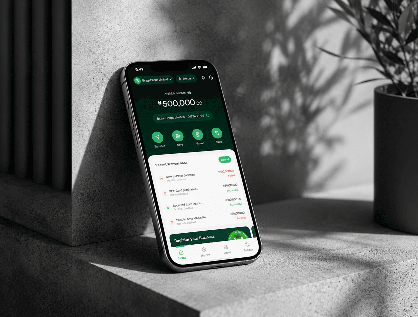
FairMoney Business has grown into a merchant-focused banking and financial services app supporting onboarding/KYC, payments (transfers & bill payments), savings/deposits, and Merchant lending (The most important aspect of the product). As capabilities expanded over time, the experience became less cohesive across modules. The redesign initiative was launched to modernize the app and create a consistent, intuitive, scalable experience that improves usability, engagement, and retention while strengthening competitive positioning.
Challenge / Problem Statement
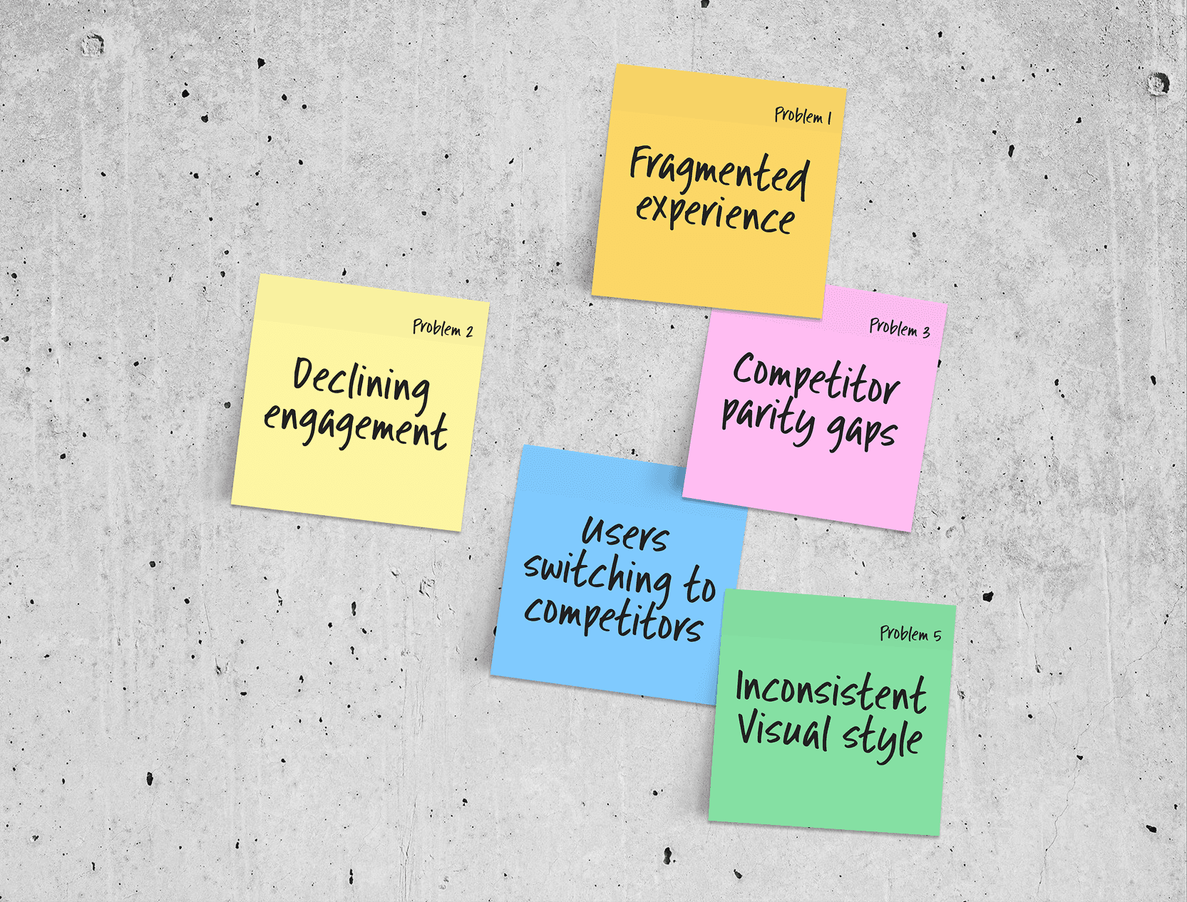
Despite offering a broad suite of services, the current app experience created friction that made it harder for merchants to complete everyday banking tasks quickly and confidently. Key problems included:
• Fragmented experience caused by inconsistent UI patterns, navigation, layouts, interaction models, and visual styling across modules (built at different times), resulting in a disconnected product experience.
• Declining engagement/retention signals, including an approximate 11% MAU decline over the last 5 months (per the redesign document), suggesting usability and experience issues may be contributing to disengagement.
• Customer insight validating UX as a churn driver: a survey of churned users found 68% cited “better user experience” as the major reason for switching to competitors.
• Competitor parity gaps, where competitor apps offered experience patterns and features FairMoney lacked (e.g., stronger interactivity, clearer summaries, and more consistent design systems), raising the bar for “expected” usability.
Discovery and Stakeholder Alignment
Discovery focused on building shared clarity on what is broken, where, and why it matters, and aligning Product/Design/Engineering plus go-to-market stakeholders on scope and success metrics. This alignment included:
• Product audit of the existing app experience to identify core pain points (e.g., inconsistent patterns, navigation friction, transaction-history usability issues, outdated UI).
• Cross-functional definition of redesign scope (what will change vs what won’t) and explicit exclusions (e.g., not introducing new financial products, not rebuilding backend services unless required).
• Launch and readiness alignment across Product, Engineering, QA, Design for rollout phases, exit criteria, and monitoring requirements.
• Go-to-market alignment (Marketing/Comms/Support) that communications should begin only after the redesigned app reaches full rollout and passes stability checks; plus defining segmentation, suppression rules, and contact policy principles.
Research & Insights
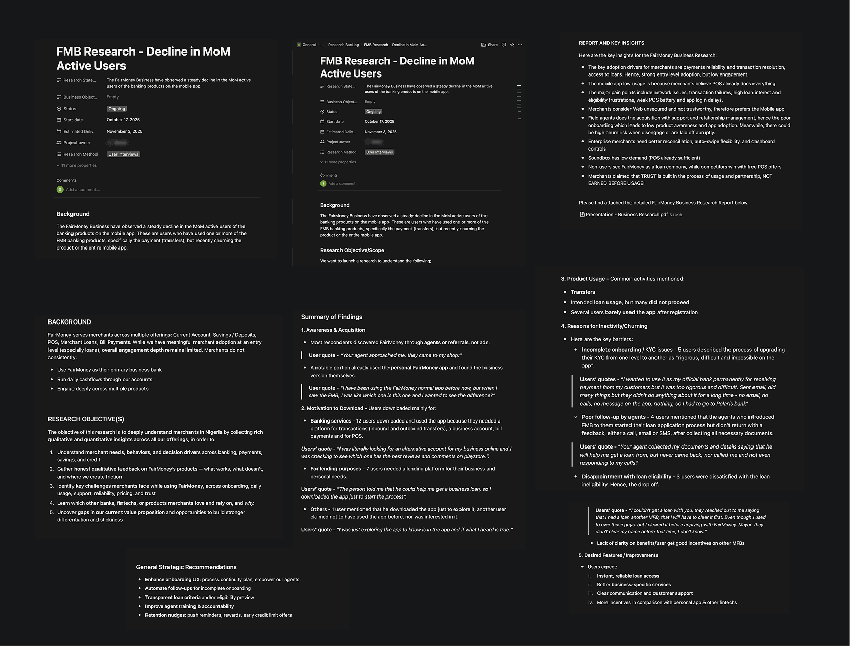
The Research was done by the research team. The research inputs and insights used to justify and shape the redesign included:
• Quantitative product signals: declining MAU/usage trends and the need to improve retention and engagement.
• Qualitative feedback: customer issues associated with UX friction, plus churn survey insight showing UX as a major switching reason.
• Competitive benchmark: parity review vs competitors (e.g., gaps in interaction design patterns and experience capabilities). Moniepoint MFB and Opay MFB was a major subject for analysis.
• Operational learnings for adoption: the plan acknowledges the risk of users being unfamiliar with the new UI and mitigates via beta/pilot, phased rollout, onboarding modals, and comms/education.
The Solution (what the redesign delivers)
A comprehensive redesign to create a more consistent, intuitive, and scalable experience across the FairMoney Business app, with emphasis on usability and discoverability—without changing core product logic. Solution scope highlights include:
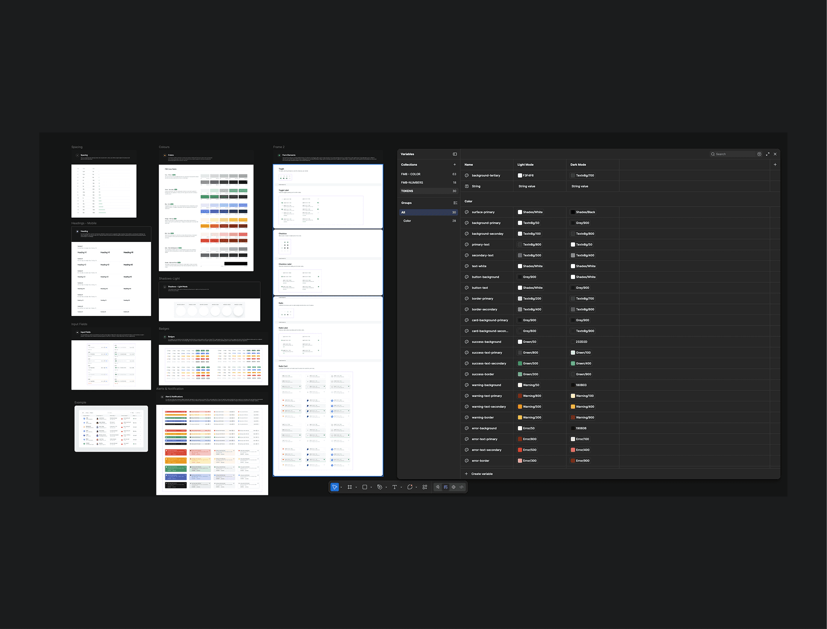
1. Design system & unified UI patterns to eliminate inconsistency across modules.
We standardized core components, layouts, navigation, typography, spacing, and interaction patterns into a unified design system, creating a consistent experience across existing modules while providing a scalable foundation for future features.
2. Home | Dashboard (the control centre)
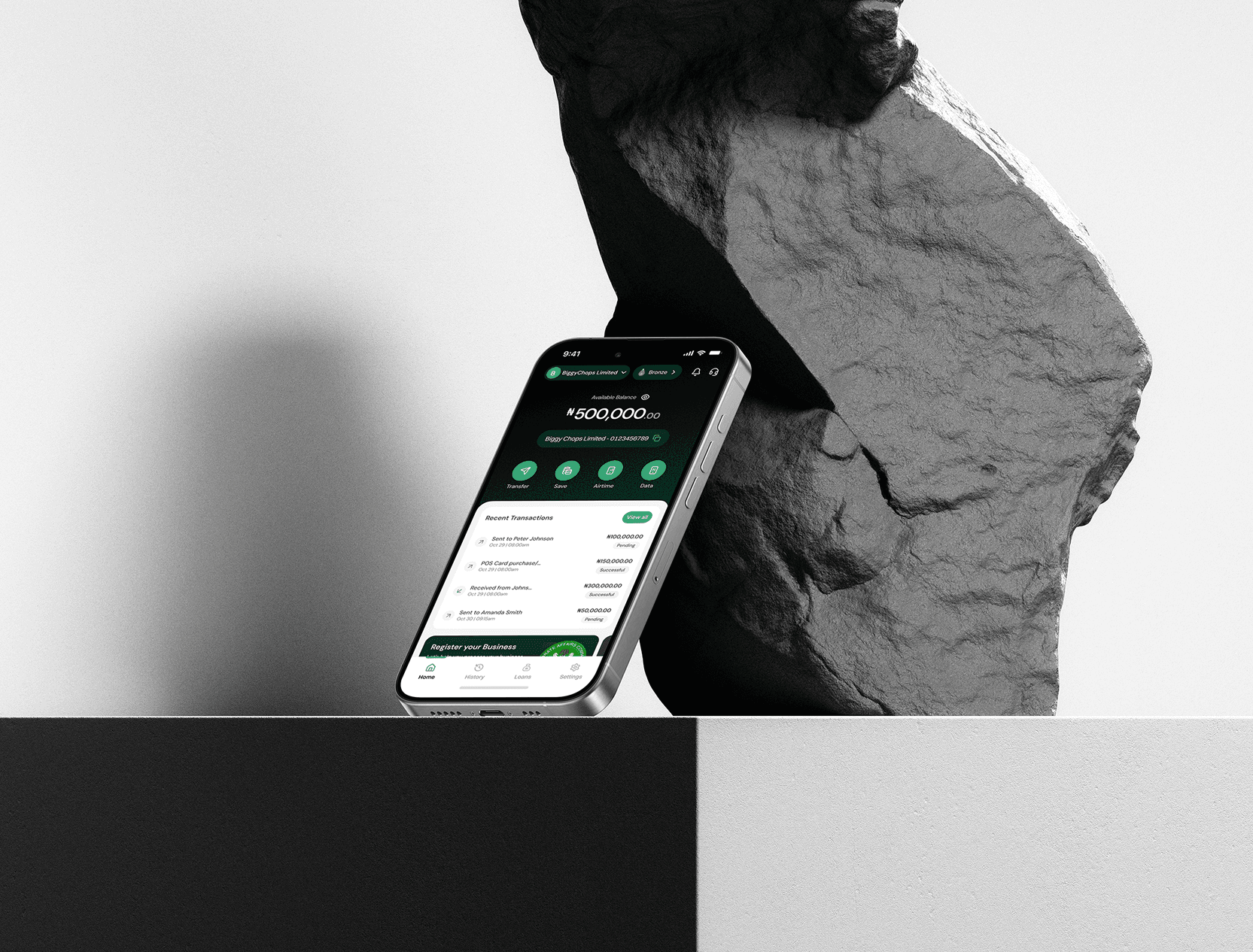
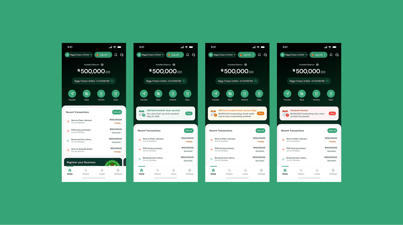
• Redesign the Home dashboard with clear information hierarchy: balance, quick actions, primary banner(s), and recent transactions.
• Consolidate multiple banners (KYC, Loans, etc.) into a consistent banner component with prioritization and scrolling.
• Add personalization: business name display and customizable shortcuts/top features.
3. Transaction History & Transaction Details (tracking money clearly)
Transaction History
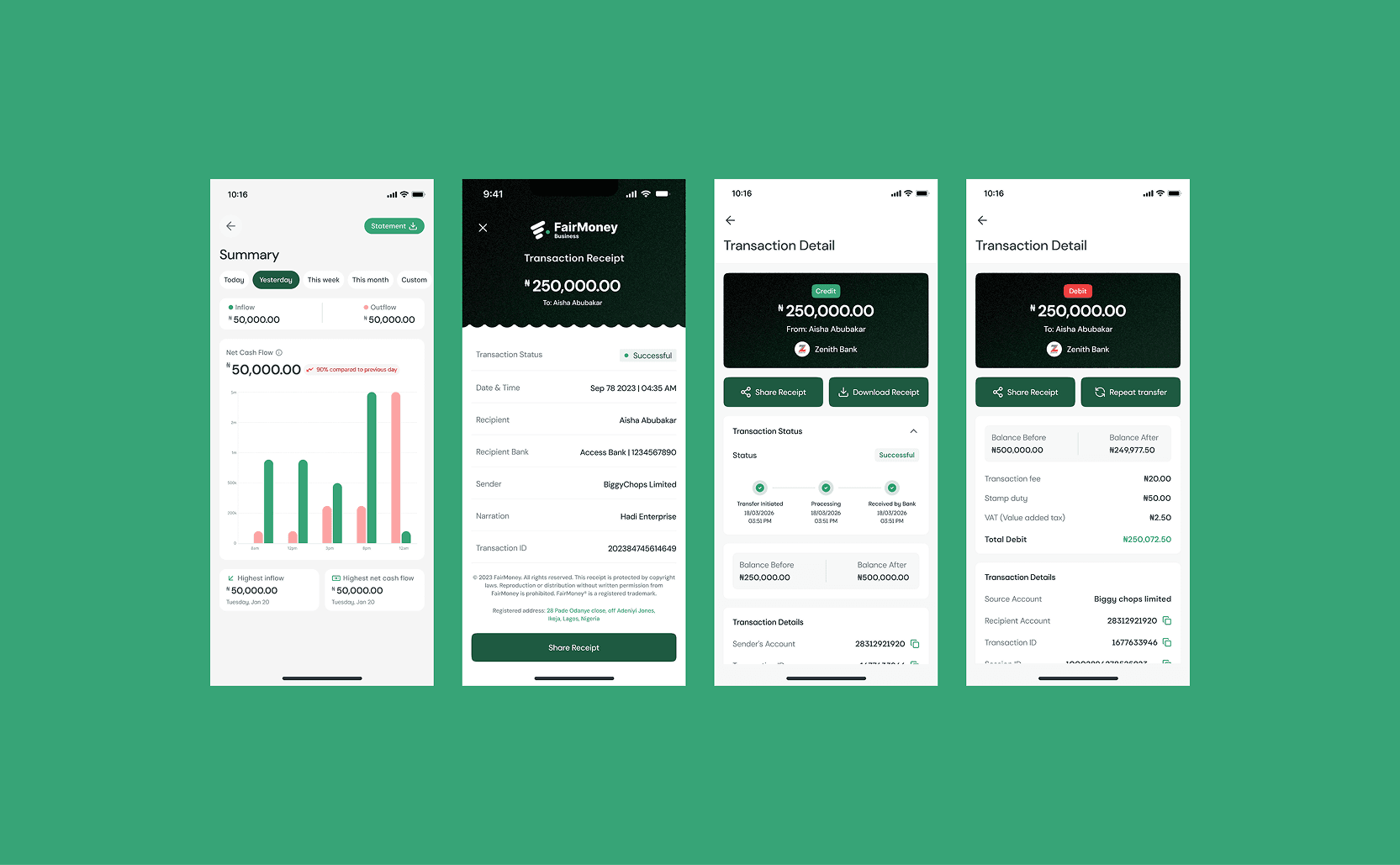
• Improve readability and navigation: clearer credit vs debit distinction, better descriptions, fee visibility on cards, grouping by day.
• Add stronger search and filter patterns and better browsing of activity.
• Introduce a transaction summary concept (inflows/outflows over a period) to help merchants understand performance quickly.
Transaction Details / Receipts
• Improve information hierarchy (what matters first).
• Add clarity features like balance before/after, transaction breakdown, and more copyable details.
• Enable quick repeat actions like Repeat transfer where relevant.
4. Transfers Flow (send money faster, with fewer errors)
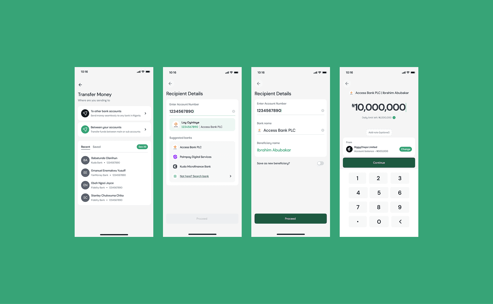
• Redesign transfer flow with progressive disclosure and stronger information hierarchy (show the right fields at the right time).
• Improve beneficiary experience:
Automatic bank matching after account input
Beneficiary name display
Suggested beneficiaries where appropriate
• Strengthen trust and clarity:
Clearer status on receipts
Better error messages and inline validation
Visibility into relevant network/status information
• Reduce friction (fewer unnecessary steps) and make narration/inputs more usable (e.g., character limits, numeric keyboard behavior where needed).
5. Bill Payments (repeat purchases, fewer taps, more confidence)
• Redesign bill-pay journeys (airtime/data/utilities/etc.) with:
Pre-filled phone number where applicable
Better contact display
Persisting numeric keyboards for number-heavy inputs
“Recent bills” to repurchase quickly
Cash-back visibility where applicable
• Improve bill-payment history/logs and states so users can confirm outcomes and resolve failures faster.
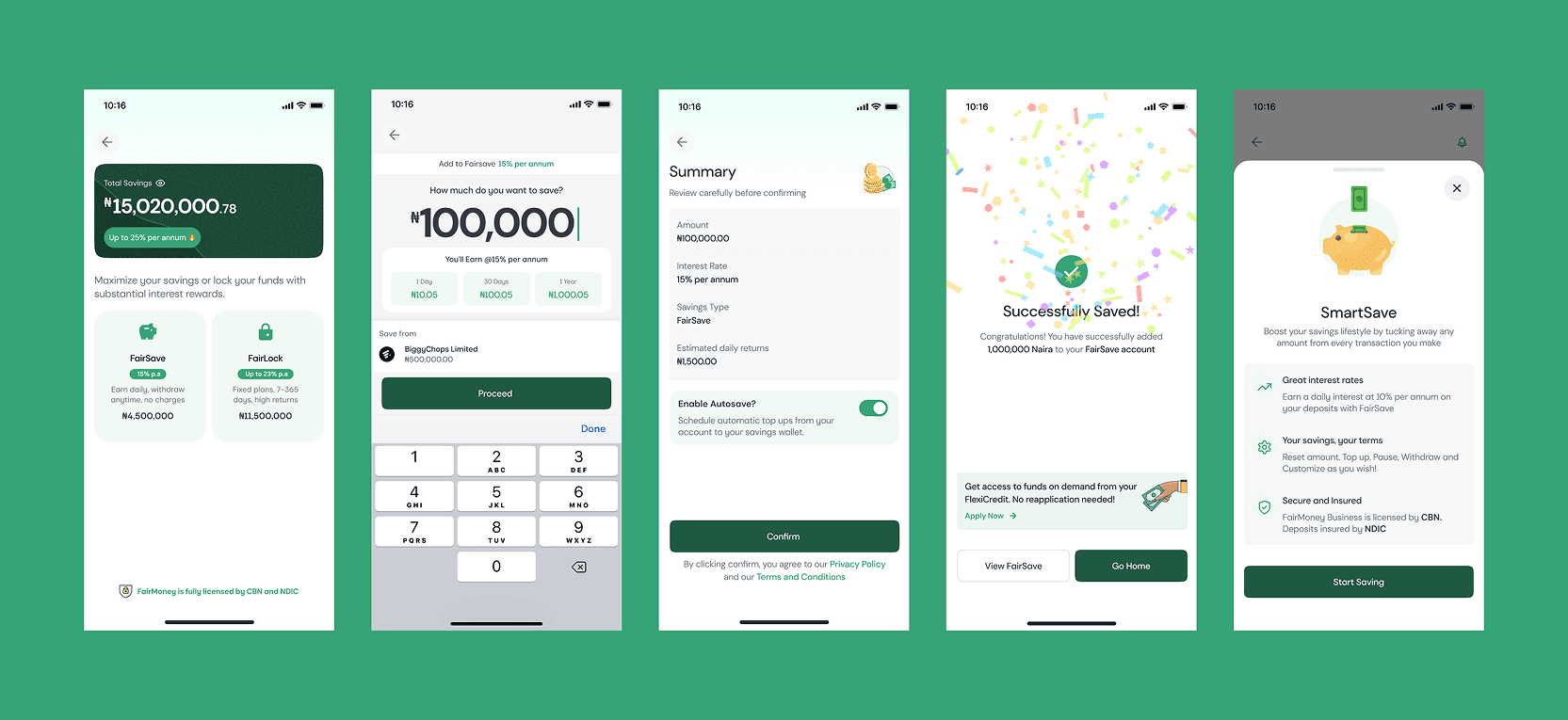
6. Savings (discoverability & clearer actions and history)
• Improve savings information architecture and discoverability (so savings isn’t hidden behind navigation complexity).
• Provide more complete history and clearer lifecycle actions (create/top up/withdraw).
• Incorporate autosave flows during savings creation where relevant.
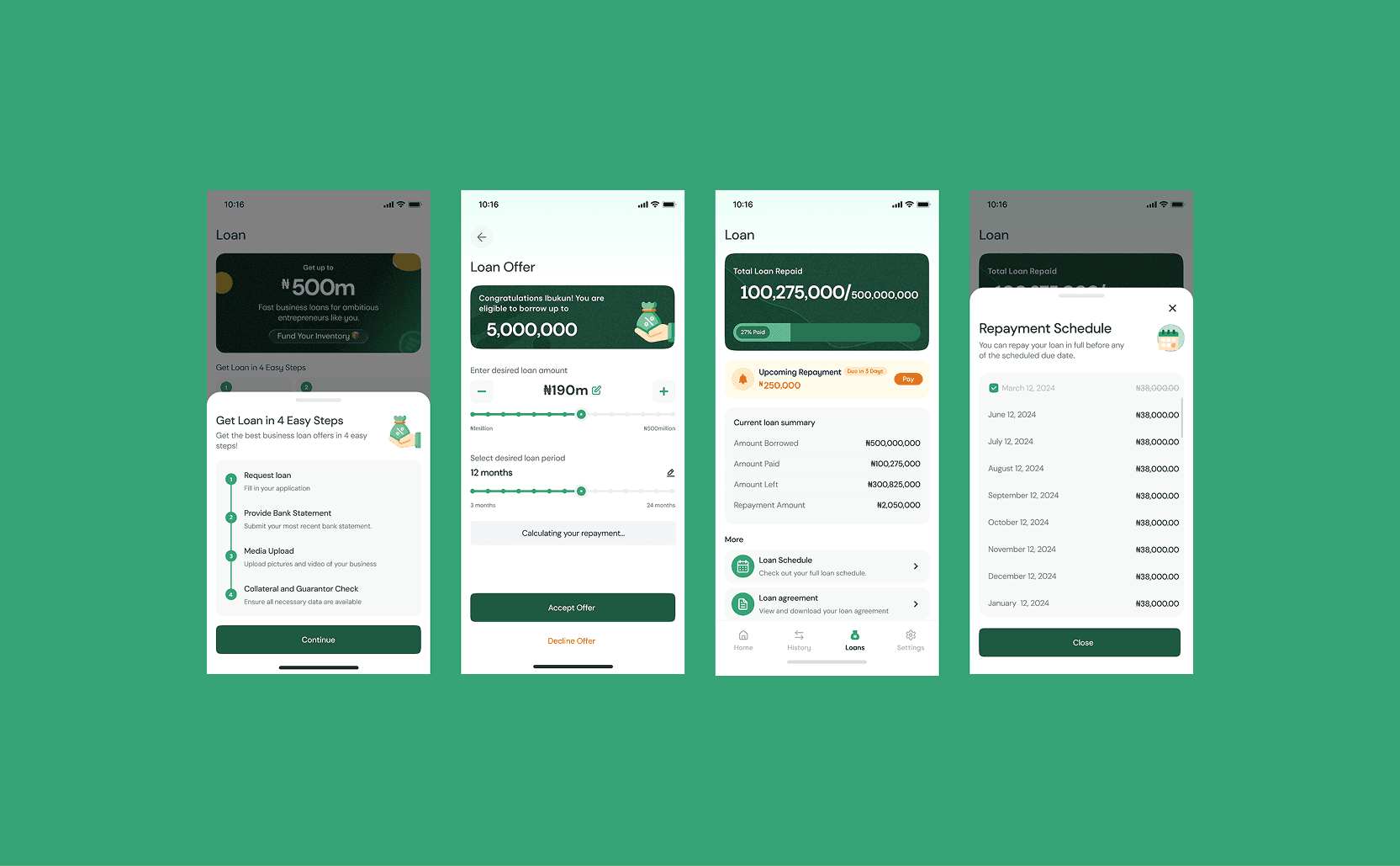
7. Loans | Lending surfaces (make lending easier to find, understand, and act on)
While the redesign does not aim to change core lending logic, it improves the lending experience across loan offer and acceptance flow, Active loan flow with upcoming repayment, Repayment Schedule, Loan Agreement, loan history, loan schedule, and the different loan states like overdue etc by:
• Using Home banners/entry points to make loan actions and prompts more discoverable and consistent with other modules.
• Applying consistent UI patterns (states, hierarchy, messaging) so loan-related steps feel clearer and less “different” from transfers/bills/savings.
• In FMB, lending is a core pillar, so the redesign supports the goal of improving how merchants apply, track, and repay by reducing UX friction across the app experience.
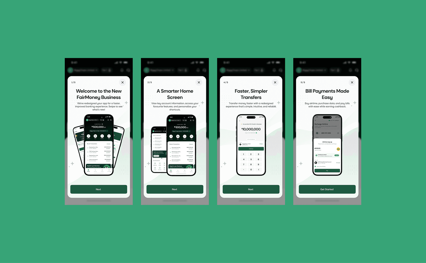
8. In-app guidance for adoption (so users understand what changed)
• Add first-launch onboarding modals to highlight improvements (home, transactions, transfers, bills) and reduce confusion after upgrade.
• Rollout plan supports adoption via beta → readiness review → phased rollout → migration → force upgrade, to ensure stability and smooth user transition.
Key Learnings
1. UX consistency is a business lever
Inconsistencies across navigation, layouts, and interactions made the product feel fragmented. A unified experience is not just visual polish—it can directly influence usability, trust, and retention.
2. UX can be a significant churn driver
Customer feedback showed that users were willing to switch products because competitors offered a better experience. This reinforced the importance of treating UX as a core product and business concern.
3. Users benchmark experiences, not just features
Competitive research showed that users bring expectations from leading fintech products. Clearer interactions, stronger information hierarchy, and consistent patterns increasingly define the baseline for a good banking experience.
4. A redesign is also a change-management exercise
Improving the product is only half the job. Beta testing, education, phased rollout, and clear communication were necessary to help users understand and adopt the new experience.
5. Real tasks reveal more than opinions
The most useful validation came from testing everyday banking journeys rather than simply asking users whether they liked the redesign. Task-based feedback exposed usability gaps and areas where expectations weren't being met.
6. Design systems create leverage beyond the redesign
The biggest long-term value was establishing reusable patterns and components that could keep the product consistent and make future features faster and easier to scale.