Introduction
Clime is a global financial platform built around fast cross-border payments. I designed the mobile product and supporting web experience across the complete customer journey — from discovering Clime and opening an account to verifying identity, sending money, managing recipients, tracking transactions, earning rewards, and managing account security.
The Challenge
International payments are powerful, but rarely feel simple.
Sending money across borders introduces a lot of complexity. Users have to think about currencies, exchange rates, fees, recipient banking details, verification, payment methods, and whether their money has actually arrived.
At the same time, financial products have very little room for ambiguity. When people move money, they need to know exactly what they are doing, what it costs, and what happens next.
The challenge was therefore bigger than designing a transfer flow.
We needed to create an experience where:
• Complexity stays underneath the interface.
Users shouldn't need to understand the financial infrastructure behind a transfer.
• Trust stays visible.
Rates, fees, recipient information and transaction status should never feel hidden.
• Security doesn't become friction.
Verification and authentication need to protect users without making every interaction feel difficult.
• The experience continues after the transaction.
Users need tools to manage recipients, track transfers, resolve problems and control their accounts.
The design question
How might we make cross-border banking feel as simple and predictable as sending money locally?
Research & Insights
I approached Clime as a complete financial ecosystem, mapping the moments where users could experience uncertainty or friction. Five principles guided the design:
1. Simplify the decision, not the information: Users don't need to understand how transfers work; they need to confidently answer send, receive, rate, cost.
2. Transparency is part of the experience: Rates, charges, and transaction status are surfaced exactly when users need them, not buried.
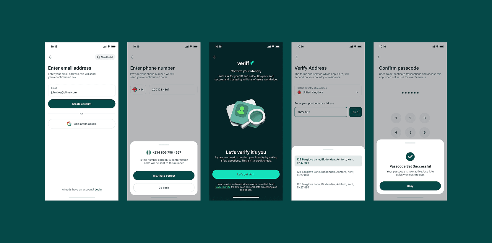
3. Onboarding should feel progressive: A single long form becomes focused steps (email → phone → OTP → details → password → identity → address → passcode), each with one clear action.
4. The first transaction shouldn't define every transaction: Saved recipients mean the product gets faster to use as a user's network grows.
5. The happy path isn't the whole product: Every state — in progress, failed, reversed — gets a clear meaning and next step, across transfers, onboarding, and verification.
The Solution
We designed to create a more consistent, intuitive, and scalable experience across the Clime Payment application, with emphasis on usability and discoverability. Solution scope highlights include:
1. A Consistent Design Language
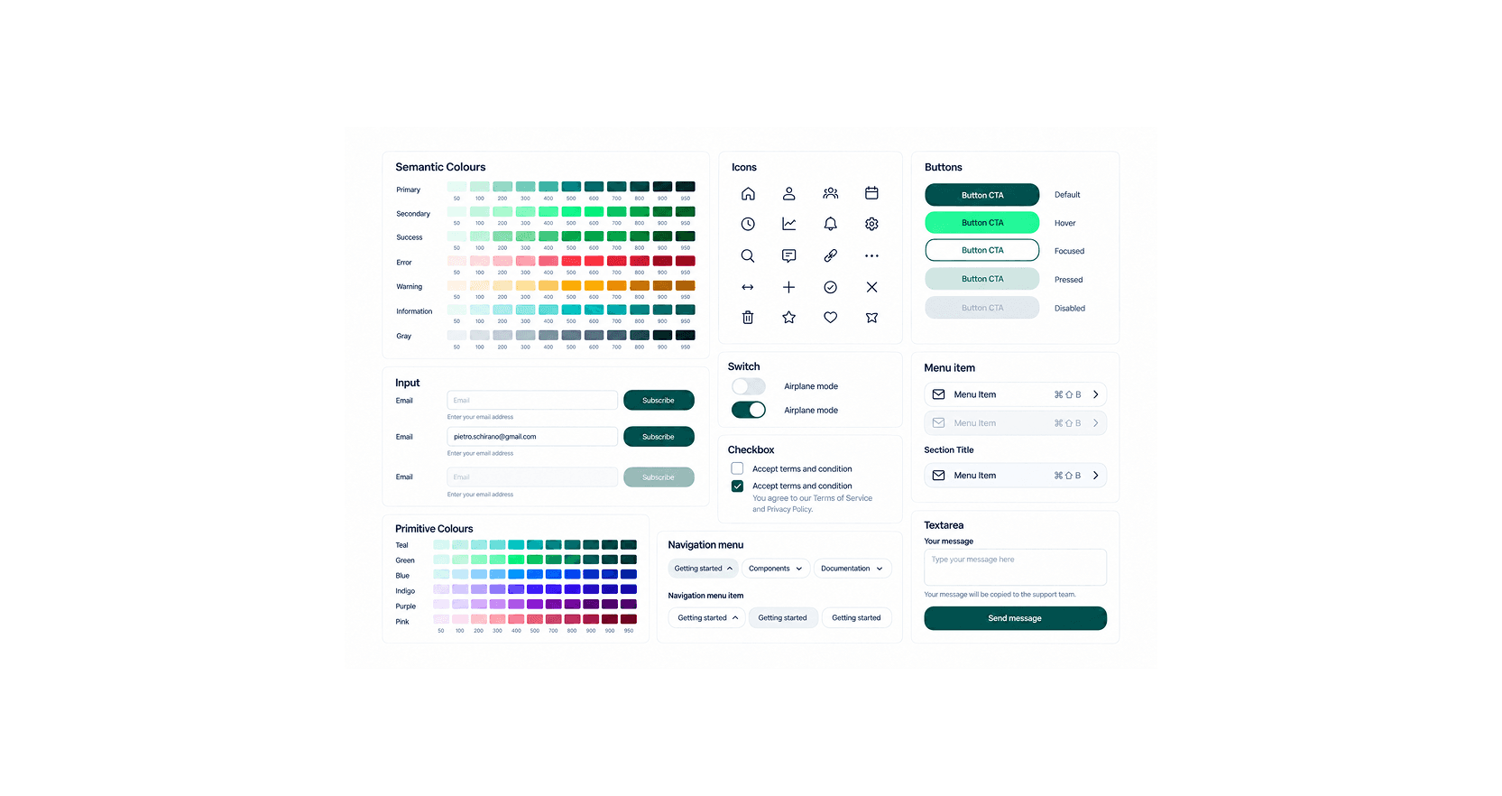
We built the design system ensuring reusable patterns for inputs, cards, modals, status indicators, and financial summaries meant users never had to relearn the product moving between Send Money, Recipients, or Security.
2. Onboarding (Identity & Address Verification)
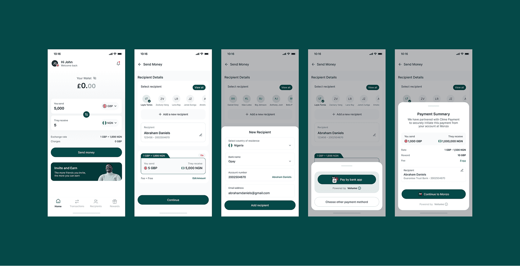
The transfer experience sits at the centre of Clime, designed to reduce the cognitive load of currencies, exchange rates, fees, and recipient details.
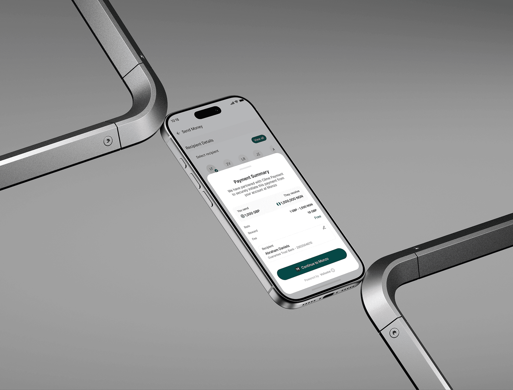
The journey: Choose amount → Select recipient → Choose payment method → Review → Authenticate → Complete
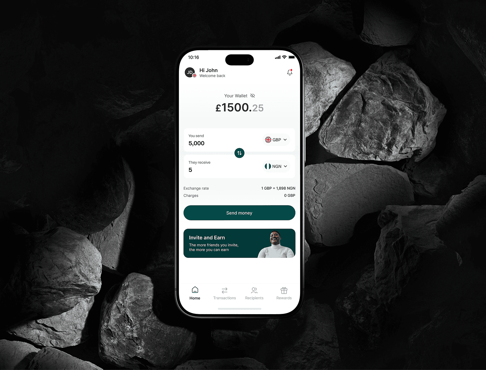
The Home screen doubles as a lightweight currency calculator, letting users gauge value before committing. The transfer summary then keeps all critical info together, amount sent, amount received, currencies, exchange rate, and charges, so users never have to do the math themselves.
KYC is woven into the product rather than feeling like a separate compliance detour. Identity and address verification each have their own guided flow, and successful verification is reflected back through notifications and account status — making compliance feel connected, not bolted on.
3. Send Money
The transfer experience sits at the centre of Clime, designed to reduce the cognitive load of currencies, exchange rates, fees, and recipient details.
The journey: Choose amount → Select recipient → Choose payment method → Review → Authenticate → Complete
The Home screen doubles as a lightweight currency calculator, letting users gauge value before committing. The transfer summary then keeps all critical info together, amount sent, amount received, currencies, exchange rate, and charges, so users never have to do the math themselves.
4. Recipients
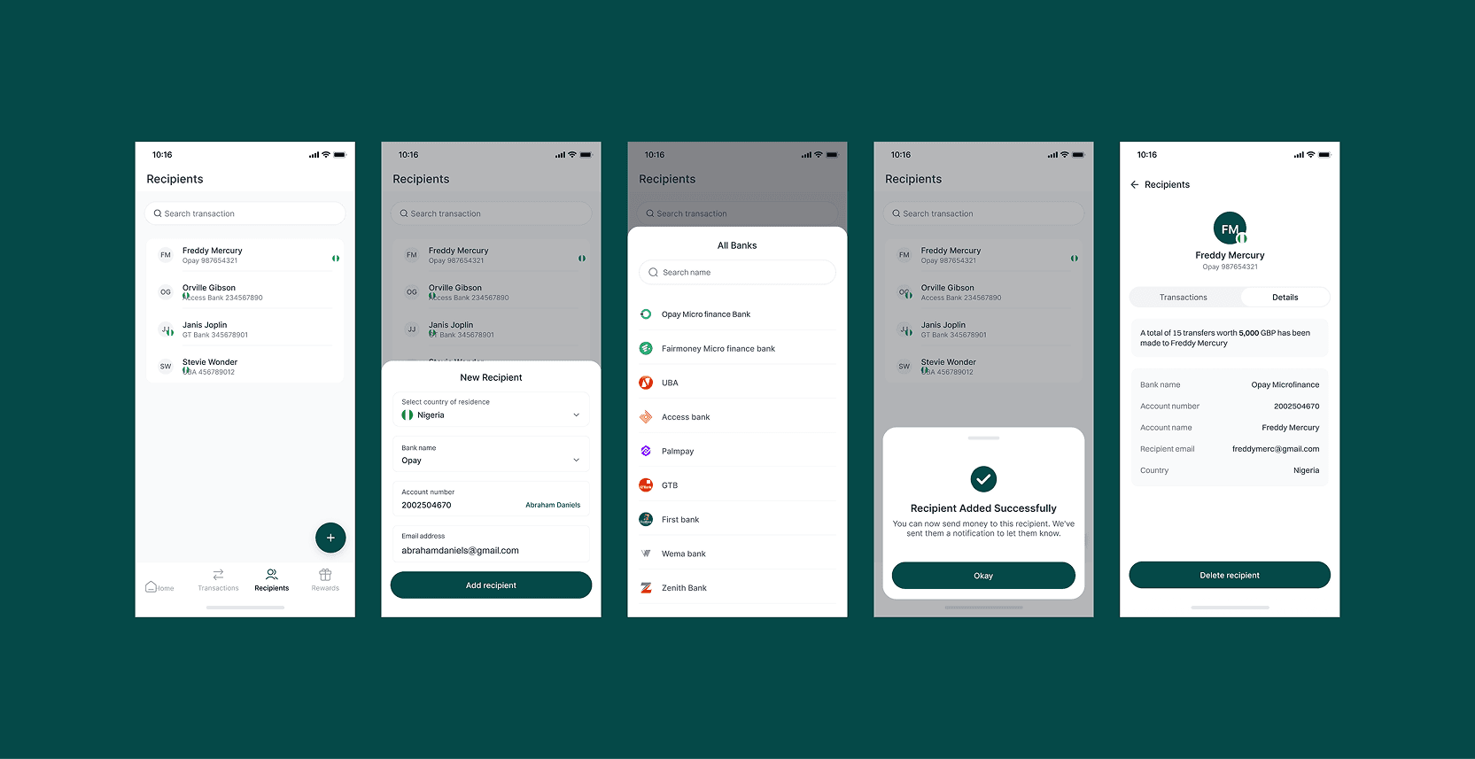
Recipients aren't just details for one transfer, they're a reusable network. Users can add, search, and manage beneficiaries, view their history, and reuse them for future transfers. The principle: the more you use Clime, the less work each transfer takes.
5. Transactions
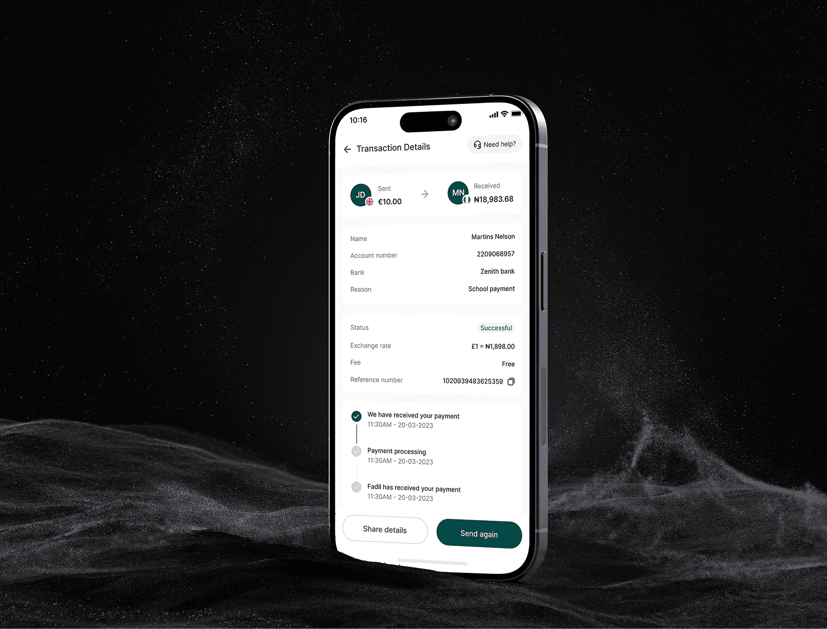
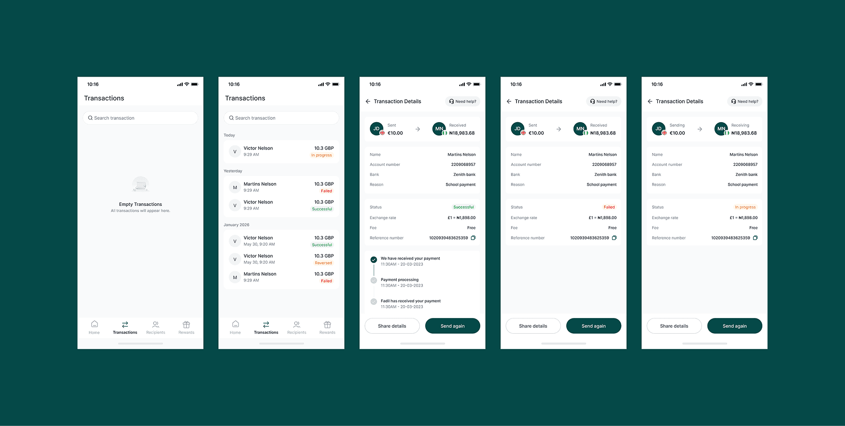
A transfer doesn't end at Send. Every transaction has a clear status (successful, in progress, failed, reversed) and a detailed view with sender/recipient info, fees, reference number, and processing timeline — so users always know where their money is, not just that it was sent.
Website UI
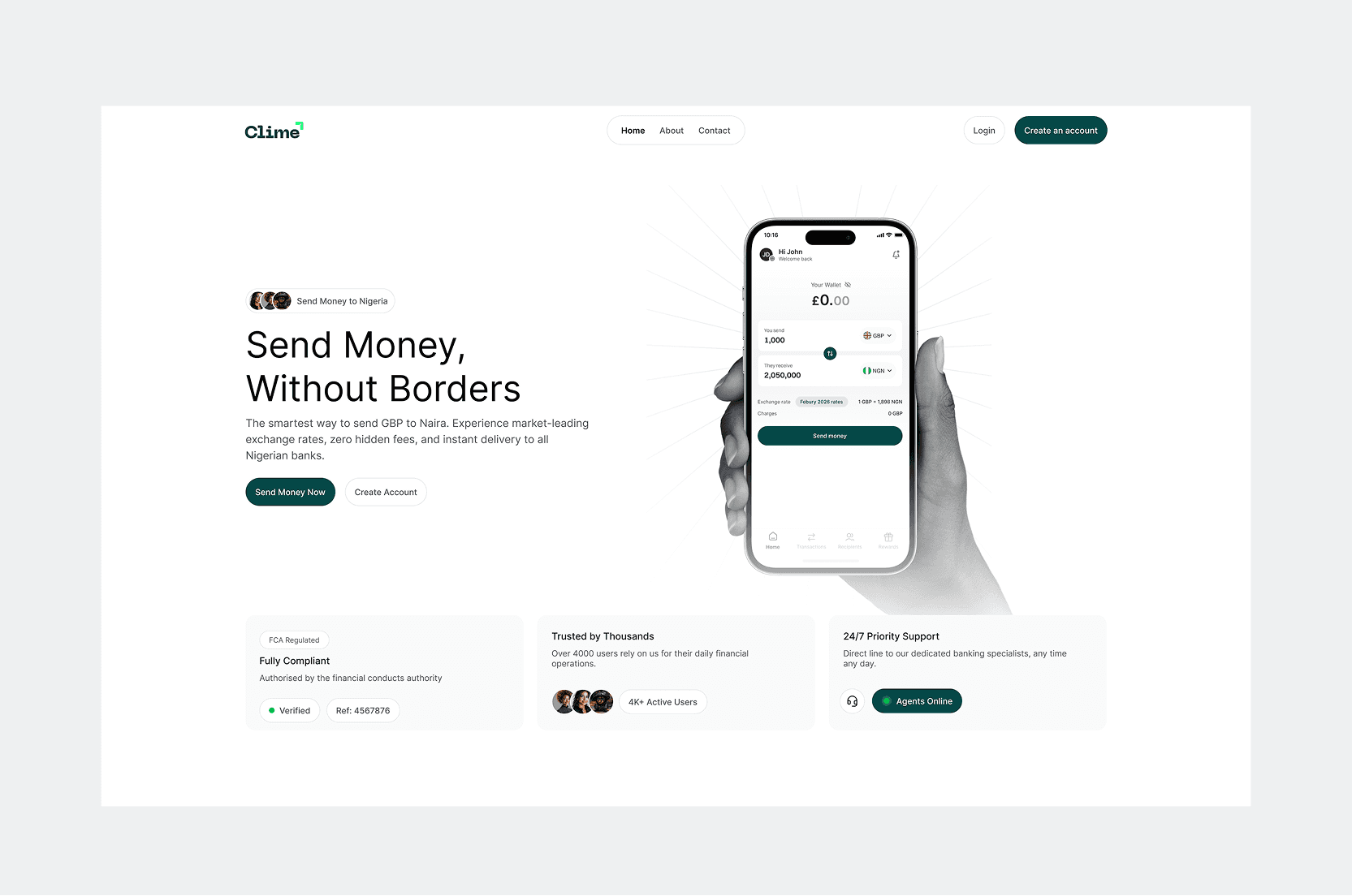
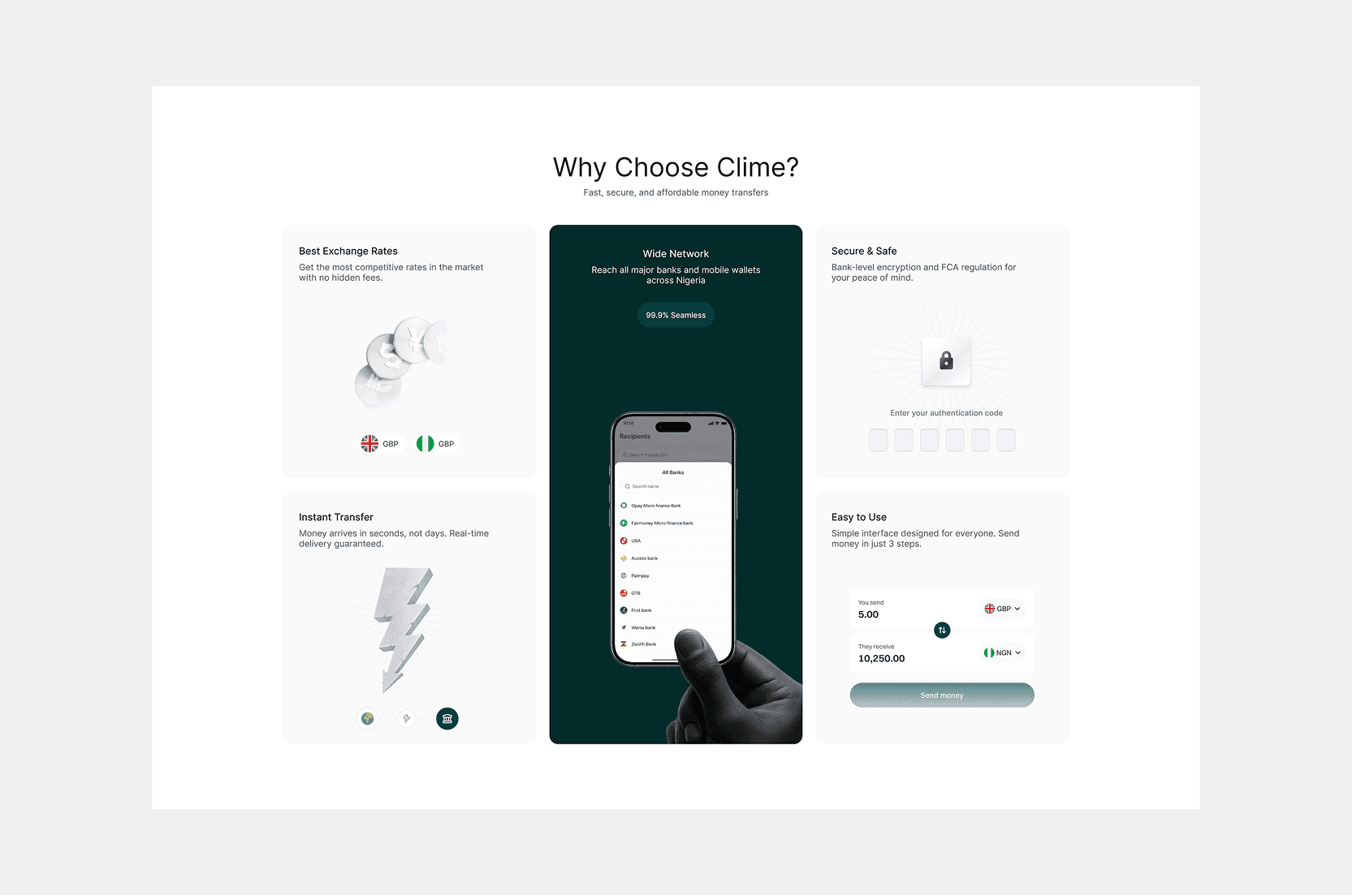
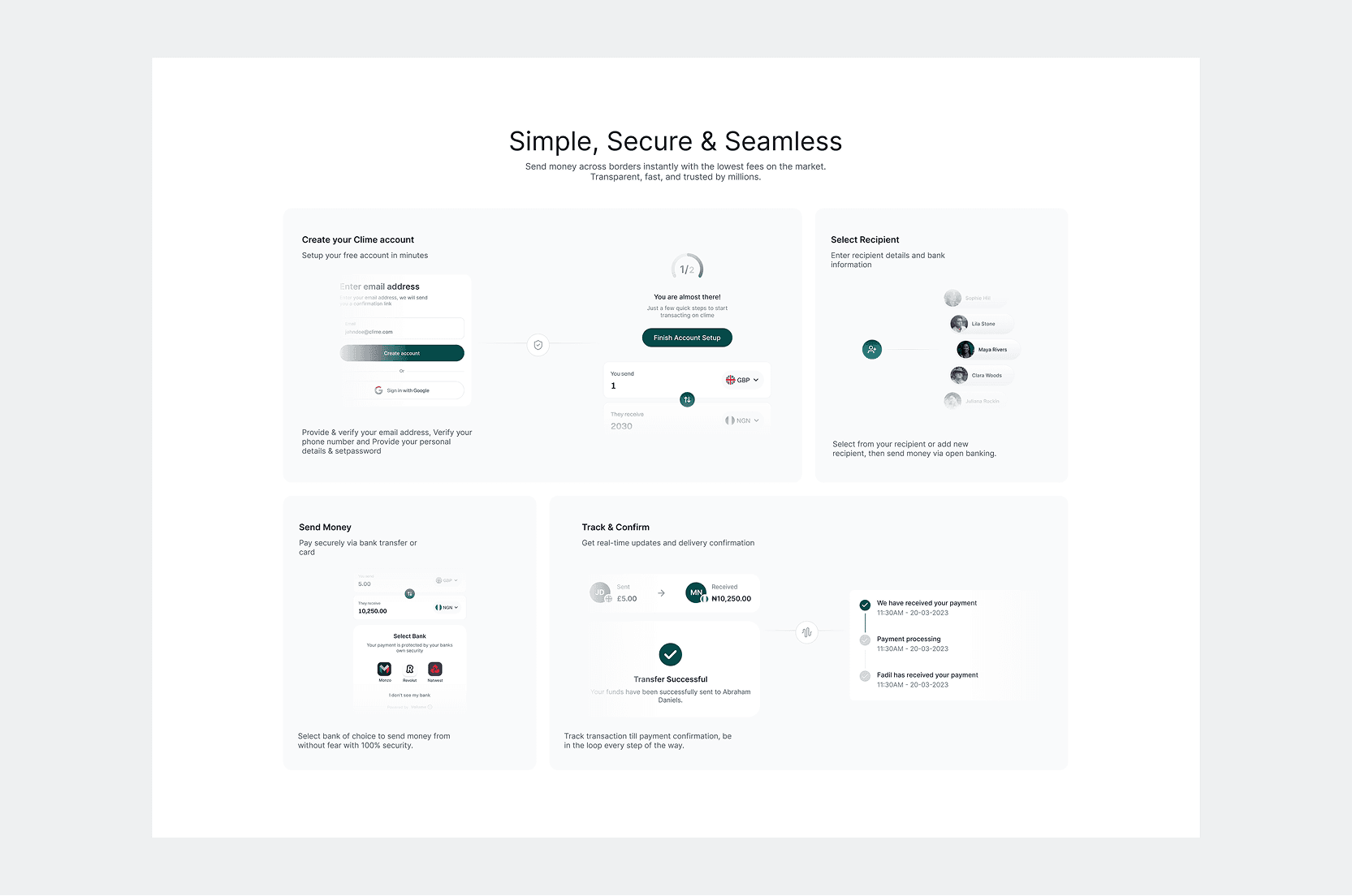
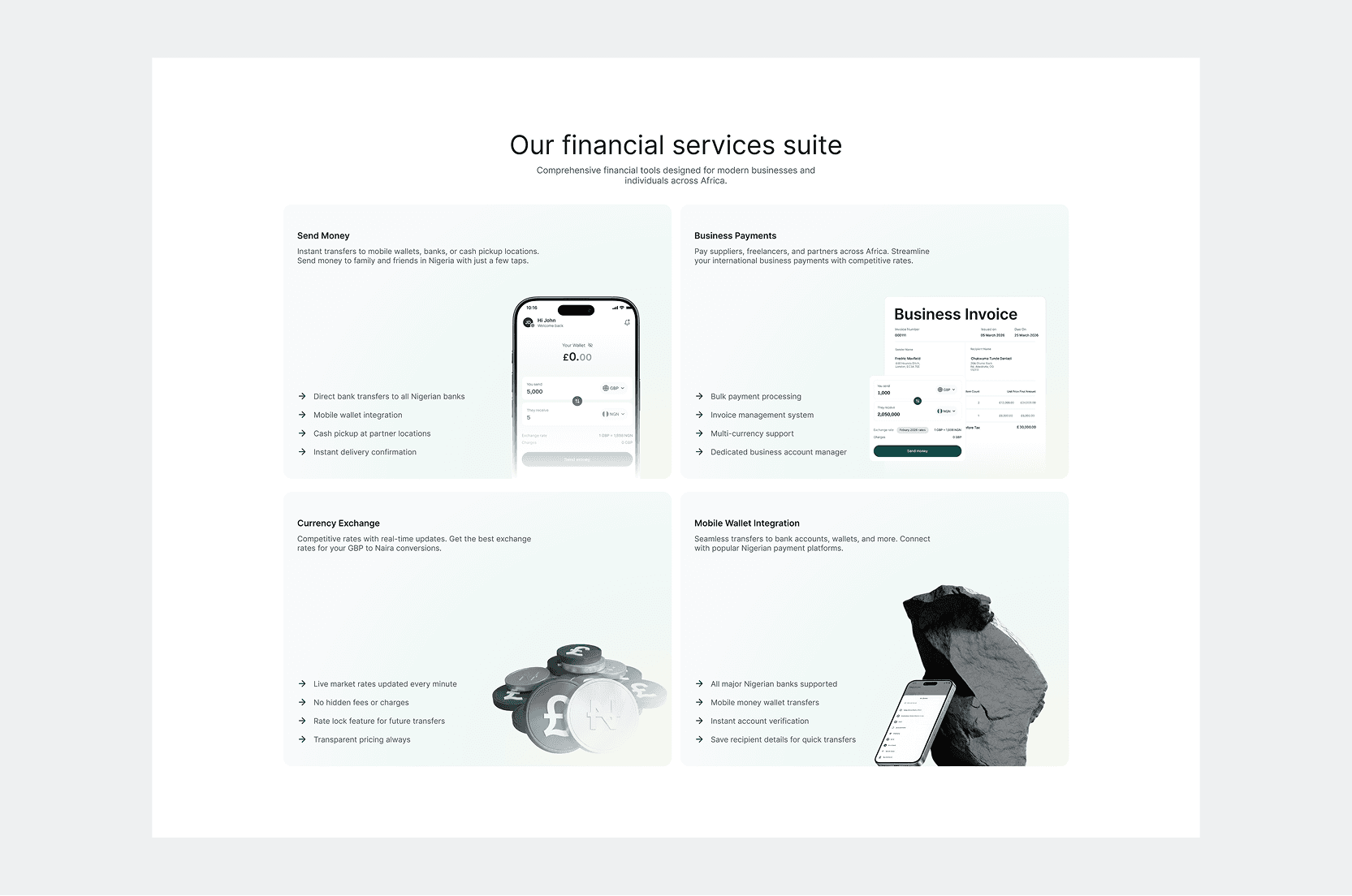
I created a marketing experience built around clarity, confidence and conversion.
The homepage introduces Clime through a simple proposition, then progressively communicates the product's benefits, features and value before leading users toward creating an account.
The supporting About experience gives the brand more context, helping users understand the company behind the product and reinforcing credibility.
From discovery to product
The website wasn't designed as a standalone marketing asset. It was designed as the front door to the Clime ecosystem
Reflection
Simplicity is not about removing information. It is about removing unnecessary decisions.
Designing Clime reinforced how important clarity and control are in financial products. A cross-border payment can involve significant complexity behind the scenes, but users shouldn't have to navigate that complexity to complete a simple task.
Throughout the project, I kept coming back to one question:
What does the user need to know right now?
That question shaped key decisions across the product, from the transfer calculator and onboarding flow to transaction states, recipient management, verification, and security.
The key takeaway
Hide the complexity, not the control.
Clime taught me that good financial UX doesn't necessarily mean showing users less. It means giving them the right information at the right moment, so they can move money with confidence while still feeling in control of what is happening.